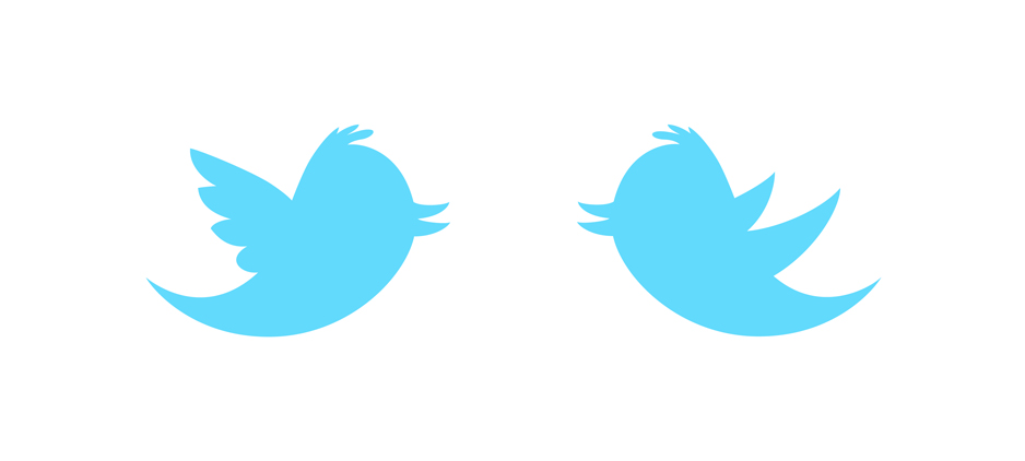
To fly, birds need wings. But there are wings and wings. Every bird has its own set to win it from gravity. When I first saw the new Twitter-icon, I reckoned this bird has flown into some pigeon and got them mixed up. Did someone add some feathers to make it look more friendly?
This Tweetie has so many blue family members in so many shapes and sizes... It really doesn't stick out much in my opinion. Simon Oxley's original bird is still my favorite because it doesn't go through all that trouble of having to look "funny". However if this bird is going to be "the one", I felt an attempt had to be made to set things straight. ;)
To be honest, I am not sure if these wings can carry such a big head, but at least they fit to the beak and tail no?
Related: Infobesity
– update 06.06.2012
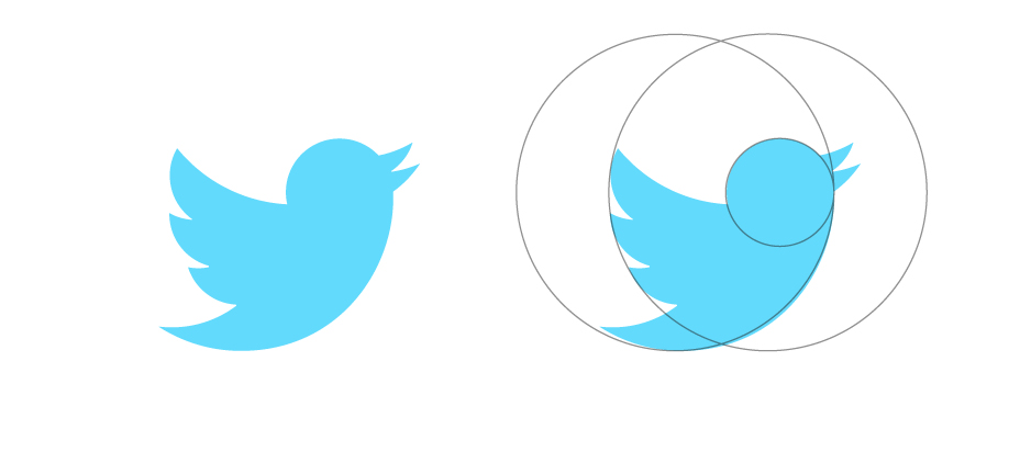
Twitter redesigned its logo. It's geometrically balanced, upright and positive, more neutral character but still recognizable as Twitter. A tweet forward!
